
Introduction
Introduction
Introduction
Signing up for a product is easy; figuring out what to do next is where users get stuck. This case study looks at how we fixed a drop in user activity right after registration.
Signing up for a product is easy; figuring out what to do next is where users get stuck. This case study looks at how we fixed a drop in user activity right after registration.
Overview
Overview
Overview
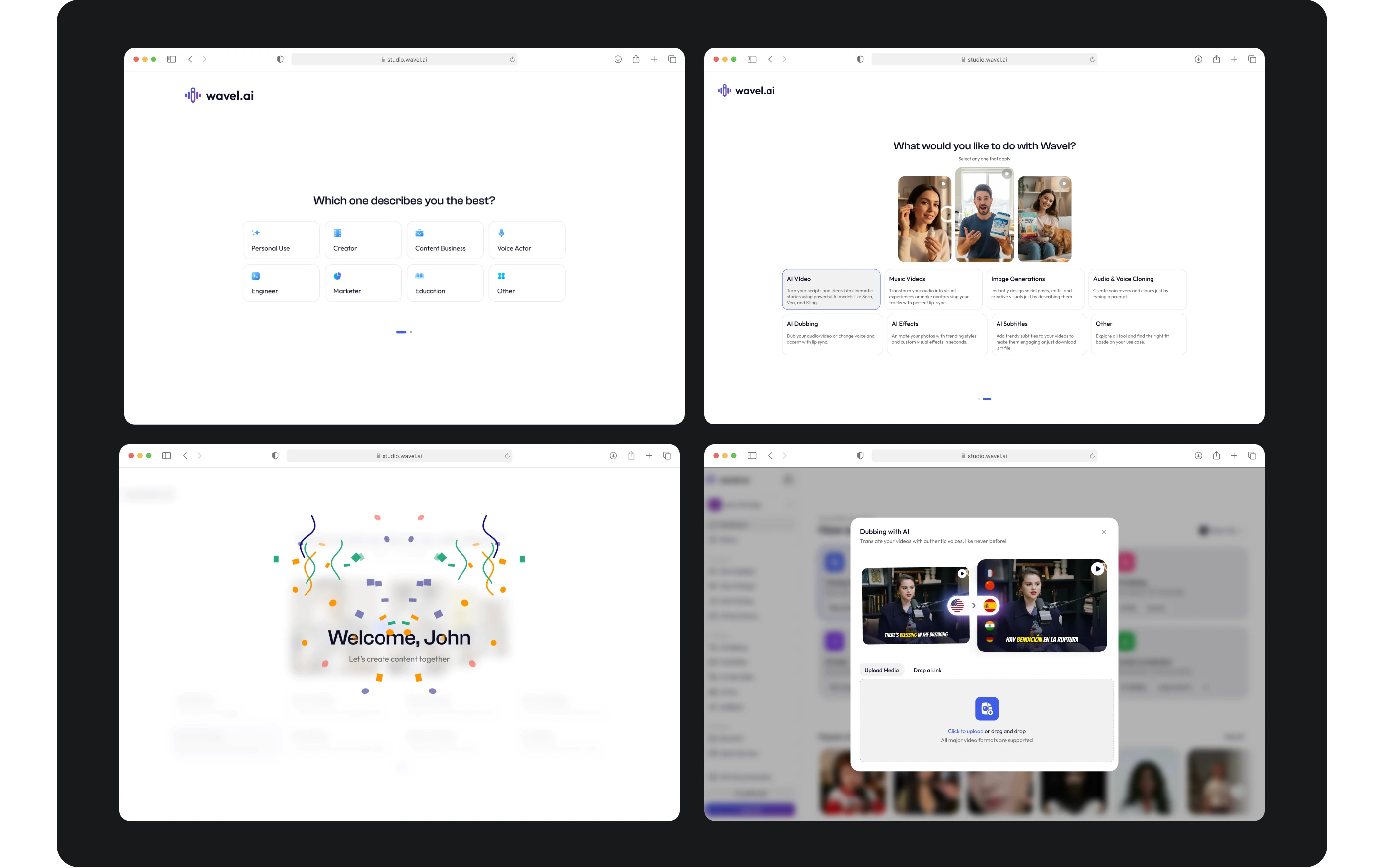
Users were signing up for Wavel but leaving without using any features. The problem wasn't the signup flow; it was the dashboard. It was too dense, forcing users to hunt for tools. I fixed this by building a responsive, 3-step onboarding wizard in Figma that asks users who they are and what they want to make, then points them directly to that tool.
Users were signing up for Wavel but leaving without using any features. The problem wasn't the signup flow; it was the dashboard. It was too dense, forcing users to hunt for tools. I fixed this by building a responsive, 3-step onboarding wizard in Figma that asks users who they are and what they want to make, then points them directly to that tool.
Role
Role
Role
Solo Product Designer
Solo Product Designer
Solo Product Designer
End-to-End Ownership
End-to-End Ownership
End-to-End Ownership
Interaction Design
Interaction Design
Interaction Design
Design and Research Tools
Design and Research Tools
Design and Research Tools
Figma
Figma
Figma
Slack
Slack
Slack

Highlights
Context
Context
Too Many Features, Not Enough Direction
Too Many Features, Not Enough Direction
Users Lost in the Workspace
Users Lost in the Workspace
Wavel has a lot of powerful AI tools. Our signup metrics were great, but our daily active users weren't growing. Once people finished setting up an account, they were thrown into a busy workspace and left to explore on their own. Most dropped off out of frustration.
Wavel has a lot of powerful AI tools. Our signup metrics were great, but our daily active users weren't growing. Once people finished setting up an account, they were thrown into a busy workspace and left to explore on their own. Most dropped off out of frustration.

Problem Statement
Problem Statement
A Dashboard Full of Cognitive Overload
A Dashboard Full of Cognitive Overload
Good Intentions, Poor Navigation
Good Intentions, Poor Navigation
We assumed users wanted immediate access to everything. Instead, the lack of hierarchy on the dashboard caused decision paralysis.
We assumed users wanted immediate access to everything. Instead, the lack of hierarchy on the dashboard caused decision paralysis.

the challenge
the challenge
Guide users from registration straight to their first completed task without making them search for it.
Guide users from registration straight to their first completed task without making them search for it.
Research
Research
Finding the Real Disconnect
Finding the Real Disconnect
Redesigning Onboarding Instead of Layouts
Redesigning Onboarding Instead of Layouts
Looking at user session data, the issue wasn't the layout of the dashboard itself—it was a lack of context. Applying Hick’s Law, I realized we were giving users too many choices at once. Rather than redesigning the entire dashboard, I focused on filtering the choices before they reached it.
Looking at user session data, the issue wasn't the layout of the dashboard itself—it was a lack of context. Applying Hick’s Law, I realized we were giving users too many choices at once. Rather than redesigning the entire dashboard, I focused on filtering the choices before they reached it.
UI Designs
UI Designs
Progressive Disclosure in Action
Progressive Disclosure in Action
Three Steps to Reduce Friction
Three Steps to Reduce Friction
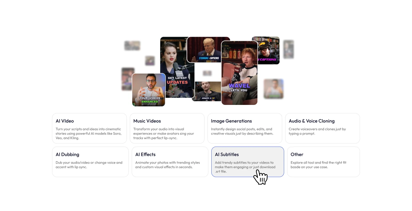
I designed a mobile and tablet-friendly 3-step wizard using the UX principle of progressive disclosure—showing information only as it becomes relevant. I used on-brand colors for the step indicators and card states to make the interface feel cohesive and trustworthy.
I designed a mobile and tablet-friendly 3-step wizard using the UX principle of progressive disclosure—showing information only as it becomes relevant. I used on-brand colors for the step indicators and card states to make the interface feel cohesive and trustworthy.

Final Thoughts
Final Thoughts
Designing with Intent Gets Results
Designing with Intent Gets Results

What we Achieved
Increased user activity rates by directing sign-ups straight to the tools they actually needed.
Increased user activity rates by directing sign-ups straight to the tools they actually needed.
Project Takeaways

Filter Choices Early
Filter Choices Early
Preventing dashboard overwhelm is easier than redesigning a complex interface.

Visual Confirmation Helps
Visual Confirmation Helps
Using hover-triggered visuals gives users confidence before they click an option.

Keep Escape Hatches Clean
Keep Escape Hatches Clean
Always let users close a guided setup if they prefer to explore manually.

Interested in working together?
Interested in working together?
Interested in working together?
Highlights